Redesign Exploration:
Small Improvements App

Background
Small Improvements is a performance management tool supporting 750+ companies to execute their feedback culture and help their employees grow. Notable customers include Zapier, Duolingo, Soundcloud, GetYourGuide, and Strava.
As in-house design team of 2, we continuously brought improvements to the application and style guide but working on large structural changes to IA, usability issues, and visual design was all but impossible.
To solve this, we kickstarted a “redesign exploration” initiative. This created as a space in which we could explore new design possibilities without caring for technical complexity or the time pressure of existing product discovery and development projects. To keep us asking the question: “What could Small Improvements be?”
Timeframe: Jan–Apr 2020, 1 morning every other week.
General UI concerns
Density of information: Small font sizes and minimal margins are optimised for density and make the app look dated and stuffed, as if made just for small screens.
Contrast: Too many UI elements resort to shades of gray, and the color palette is not fully contrast compliant.
Too friendly: The combination of colorful illustrations with bright colors, outlines and shadows on interface elements – cards, buttons, form elements – have made the app style so “approachable” that it started feeling unprofessional at times.
Rigid structure: Our UI doesn’t extend beyond 1440px. With ~90% of sessions coming from screens 13” or higher, our users’ screens are often underused, especially when dealing with high complexity screens.
Navigation
Current navigation is confusing and inefficient by forcing the same structure to work for HR(Admins) and Employees, and it also forced a lot of the HR-specific pages to be crammed in tabs under “Company”.
A split navigation for HR and Employees will allow us to cater to each role’s navigation needs and provide quick access to the most important pages. By providing a simple toggle, HR users can easily jump between their own roles of Administrator and Individual Contributor.
After addressing the main navigation issues, we picked a number of screens to redesign that could both:
Paint a clear picture of the idea we had for a revised UI
Allow us to address some of the other structural pain points
Home page
The main entry point for most users has lost a bit of its clarity and purpose. It’s currently designed as a page to passively scroll through, with activity from other users in the tool (i.e. social network) but it should instead be optimised for completing upcoming tasks. With the suggested divided navigation, we can also optimise the home on what matters most to each user role.
(Before)
(After)
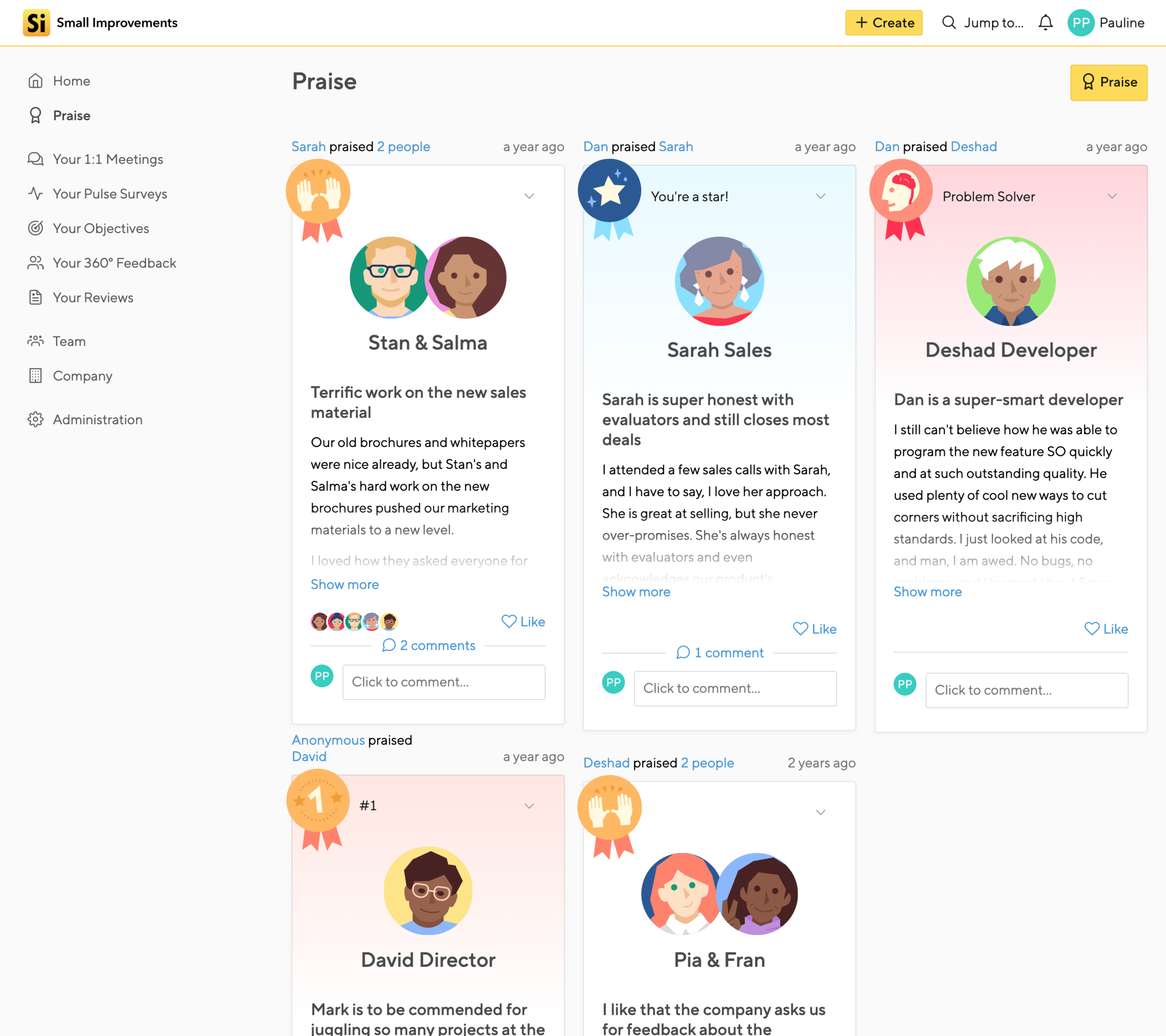
Praise
By removing the cartoony version of our praise badges, the page takes a cleaner and more professional look. Still colorful and celebratory, but not childish.
Meetings
Research showed us that users don’t take value from our split meetings layout, and it has also proved to be too limiting for us to explore other functionality in this feature.
Writing mode
The “infobox”, which includes an introduction and metadata about the feedback survey being filled, ended up taking too much real estate on the page, sometimes pushing the first question outside the viewport. The metadata should not be a distraction from your main task.
Feedback Admin screens
Our features “360° Feedback”, “Performance Reviews”, and “Requested Feedback” are very similar to each other in purpose and form. At the moment, any user has to know what is the format behind the feedback in order to easily find it, and it’s hard to have a good overview.
By hosting them all in the same page, we can take advantage of our existing cycle timeline viewer to show how all kinds of cycles overlap in time.
Cycle creation flow
Setting up a performance feedback cycle is a complex task that requires focus.
By giving the creation experience its own isolated flow, removing surrounding complexities and distractions, the UI and the process become less overwhelming and error-prone.
Conclusion
This was the first step, but what comes next?
After having received an enthusiastic response from the rest of the product team, we now want develop a few of the core concepts a bit more, define a solid set of changes to the Styleguide, and break some of these ideas into smaller projects that can be incorporated into our regular product discovery and development processes. Assessing feasibility, validating those ideas, and iterating on their usability.
Eventually, the UI update should be launched in sync with a broader brand refresh and the new logotype that you can see on the mockups.


